News, Perspex Panels
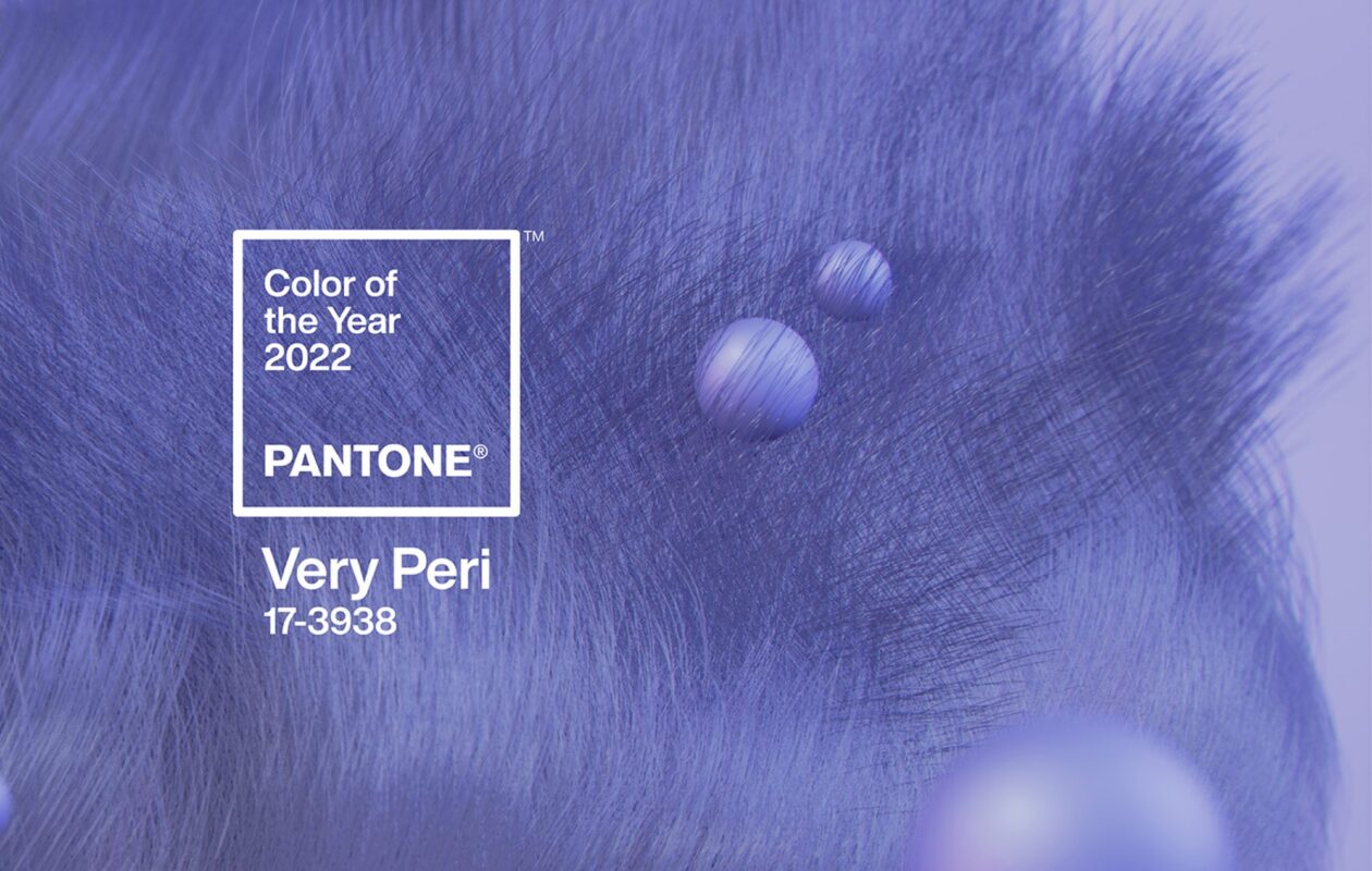
Colour of the Year 2022: Very Peri
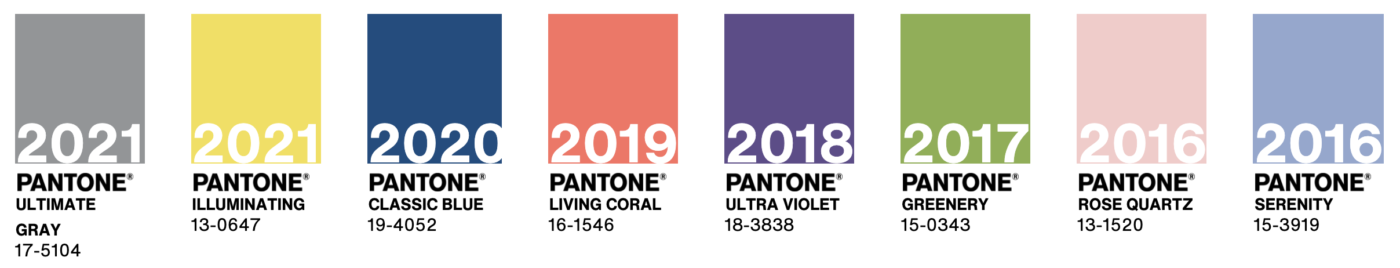
For 23 years, Pantone’s Color of the Year has influenced product development and purchasing decisions in multiple industries. Including fashion, home furnishings, and industrial design. As well as product packaging and graphic design.
How is the Colour of the Year chosen?
Pantone Colour Institute created the Colour of the Year as a representation of popular creative industry colours. Confirming them as the trend setters for all things colour in the industry. The Pantone colour team research and explore influences from around the world. From the entertainment industry to technology, fashion, travel and events, as well as textures and effects. Also, they take into consideration political, economical and environmental issues and stories and what these convey through colour.
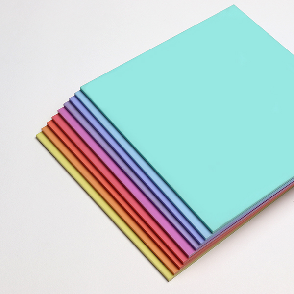
What We Offer
Perspex Panels offer over 60 shades of acrylic in a wide variety of finishes. We try to offer a colour match for any project, including the Colour of the Year. For 2022 and Very Peri, we would match Parma Violet or Bubblegum Blue from our Pastels selection. Finally, these Pastel colours have one gloss side and one satin side. This provides a dual purpose and great for creating texture in a project.