
Guides, Perspex Panels
Choosing The Right Colour
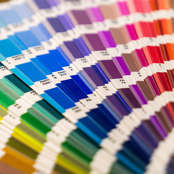
Choosing the right colour Perspex Sheets for your project can be tough. There are such a huge range of colours available and it can be difficult to decide which one is right for you. Whether you are a brand creating new shop signage or bringing some colour into your home, we have some advice to help you decide.
Understanding Colour
Before diving head first into deciding colours, a basic understanding of colour theory could come in handy when choosing shades. Below are some insights into primary and secondary colours, emotional impacts and information on defining a brand. All helpful for deciding on what you want to communicate, without saying a word.
Primary Colours
Primary colours are the three main shades that make up every colour there is. A combination of red, yellow and blue.
Secondary Colours
Secondary colours are created when mixing two of the primary colours together. Such as green, purple and orange.
Colour Value
The value of a colour is determined by the amount of white or black being added. Lighter colours such as pastels, have more white added to them to reduce their visual impact. When more black is added however, this creates a stronger visual and a higher colour value. You can adjust these factors to create varying values and impacts. Having a softer or harder visual impact.
CMYK vs RGB
The CMYK (Cyan, Magenta, Yellow and Black) and RGB (Red, Green and Blue) define whether artwork is being printed or not. CMYK is used for printed material, such as magazines, posters and physical documents. Where as RGB is digital material such as website graphics, social media posts and digital documents. This is important to consider when referencing colours, as this can drastically effect the shade.
Emotional Impact
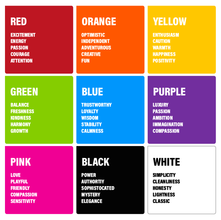
When choosing the right colour for your project or branding, it is also important to consider emotional triggers and what they convey to the audience. Being aware of the combination of colours and the effect they may have on your audience can help you make the right impact. Studies have shown that 90% of initial judgements are influenced by colour alone. So colour is one of the main factors to consider in any project. Below are some of the main colours and their emotional impact. Also how different industries use them to their advantage.
Industry Uses
- Red is often used by the food, entertainment and sports industries. To create a sense of urgency, to stimulate and encourage their audiences. For example, McDonald’s, Netflix and CNN.
- Orange is often used by the transport, entertainment and food industry. To express freedom, to fascinate and draw the attention of their audiences. For example, Nickelodeon, Fanta and EasyJet
- Yellow is often used by the travel, leisure and food industries. To energise, create awareness in their audience and effect their mood in a certain way. For example, Subway, Snapchat and DHL.
- Green is often used by environmental, educational and farming industries. To create a sense of balance, encourage and relax their audiences. For example, BP, Whole Foods and Spotify.
- Blue is often used by the technology and communications, finance and health industries. To create a sense of calm, suggesting security and precision. For example, Dell, Samsung, and the NHS.
- Purple is often used by the shopping, food and lifestyle industries. To create a sense of luxury, boldness and wisdom to their audiences. For example, Cadbury, Hallmark and Yahoo.
- Pink is often used by the beauty and fashion, children’s products and food industries. To communicate a fun, youthful, creative energy to their audiences. For example, Barbie, Baskin Robins and Too Faced.
- Black and White are mostly used in combination with other colours across all industries. They ground the colour scheme and help the logo to stand out. Creating a timeless, classic look that radiates status, usually used by established companies. For example, Apple, The New York Times and Louis Vuitton.
Defining an Identity
Many of the largest companies in the world are recognisable from their colour scheme alone. This is great marketing for them and makes them stand out against the crowd. Tying their brand to specific colours keeps the brand in mind when the audience sees that particular colour. Such as purple, the association to Cadbury is almost instantaneous.
Some brands even create their own Pantone shades such as Tiffany & Co: Tiffany Blue, McDonald’s: French Fry Gold and Mattel: Barbie Pink. Having these definitive branding colours in the Pantone library creates consistency over branding. Both with physical displays of products in shops and posters to online marketing and website creation. Also, some only allow for the company to use that particular colour, making it exclusive and one of a kind.
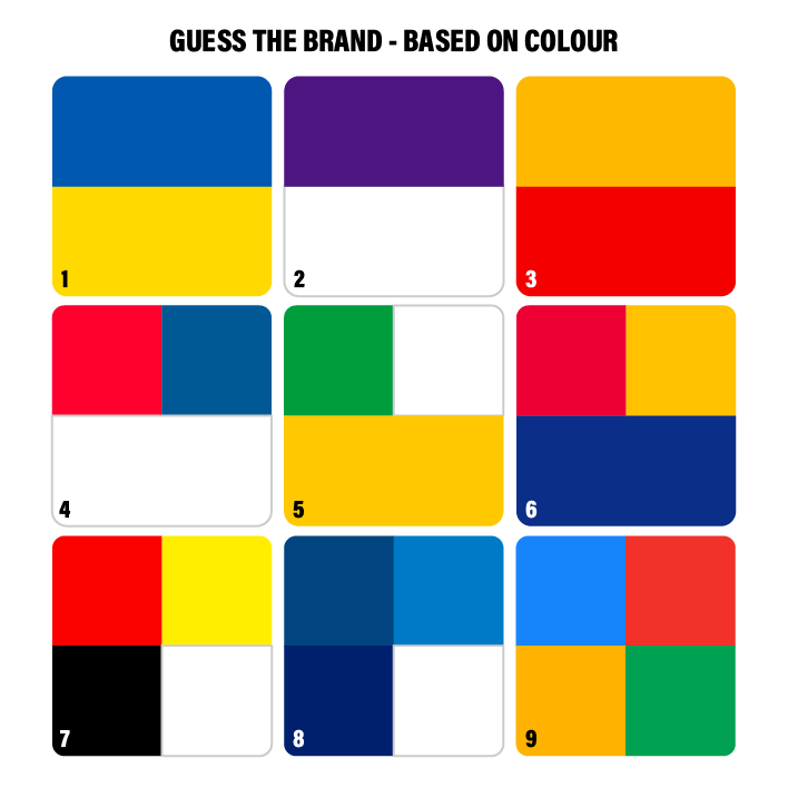
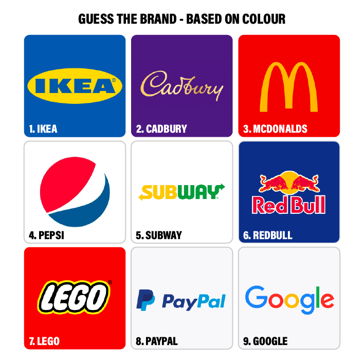
Below are nine global brands with recognisable branding. From two, three and four colours, see if you can guess the brand.
Top 100 global brands most popular logo colours:
- 34% used black
- 30% used blue
- 30% used red
- 9% used yellow
- 7% used green
- 6% used grey/silver
- 5% used orange
- 2% used brown
From these percentages, we can gather that most successful global brands aim to create a bold, reliable colour scheme. Using the primary colours alongside standard black and white. They aim for an identity that is memorable to not only their audience, but the population as well.
If you would like some advice or guidance on choosing the right colour for your project, please do not hesitate to contact our team. Email info@perspex-panels.co.uk. Also, we have a range of helpful blog posts and guides for choosing the right acrylic. Including how to clean the material and more.
For more information on colour selection and properties, explore our Colour Swatches page. Perspex also offer a Colour Library and Technical Data Sheets which can help when choosing colours.