News, Perspex Panels
Colour of the Year 2021: Illuminating & Ultimate Gray
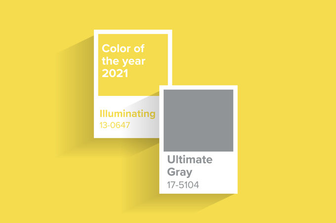
Pantone Colour of the Year 2021: Illuminating & Ultimate Gray
Pantone have announced their highly anticipated Colour of the Year for 2021. This is anticipated by designers across hundreds of industries from fashion to travel. These colours represent what is going to be the “it” shades for the year. Since 2000, the Pantone Colour Institute have been at the forefront of colour trends. Releasing the top colour for the new year. In the past, colours have included Classic Blue, Living Coral, Ultra Violet and Greenery. These inspire new palettes for industries to work with. So, the colour can be found weaving its way on to the catwalk and into peoples homes after its release. Alongside a scheme builder, Pantone also provide five original schemes involving their existing colours. Incorporating and harmonising colours to give users inspiration and ideas.
For 2021, Pantone have chosen Illuminating, a bright yellow and Ultimate Gray, a neutral mid tone grey. The contrast of the bright yellow with the muted neutral colour conveys a strong message. Pantone express that the colours represent an uplifting and hopeful feeling. With a strong and stable foundation, this represents the feelings going into 2021.

How is the colour chosen?
Since 2000, the Pantone Colour Institute created the CotY as a representation of popular creative industry colours. Confirming them as the trend setters for all things colour in the industry. The Pantone colour team research and explore influences from around the world. From the entertainment industry to technology, fashion, travel and events, as well as textures and effects. They also take into consideration political, economical and environmental issues and stories and what these convey through colour.
For example, Living Coral, the 2019 choice was inspired by the way colour effects our lives and the concerns of the environment. The shade focuses on the planet and global warming. Bringing attention to coral reefs makes this particular colour choice fitting. For 2021, the dual choice follows a extremely difficult and life changing year for all. The combination of a strong, stable, grounded colour with a bold light at the end of the tunnel. So, with a hopefulness and spirit at the forefront of everyones minds, this choice was wise for the new year.

Did you know?
This isn’t the first time the CotY has become a duo. In 2016, Rose Quartz and Serenity were selected as the shades of the year.
What we offer
Perspex Panels offer over 60 colours of acrylic across a range of finishes. Including gloss, satin, frosted, glitters and more. If you are wanting to incorporate these popular shades into your home or projects this year, we have got matches for both of these. For Illuminating, we have two options. Standard gloss Yellow, which is a solid acrylic which reflects no light. Also, we have a satin pastel yellow called Lemon Bonbon. This is also solid, with one gloss side and one satin side. Secondly, for the Ultimate Gray we have a solid gloss Grey. This is a solid acrylic, which reflects no light. Also, we have another grey option from our satin neutral range called Ash Grey. This is a double sided satin finish which is more warm toned than Grey.
